Christine de Beer - effortless floral craftsman
Designing with Mother Nature
- 20 February 2013
- and more
My article in the Mother's Day Design Issue of
Mother Nature knows best. That is one of the greatest lessons every floral designer should learn in their career. Yes, you can manipulate stems and wire blooms to coax lines to flow, and shapes to bend but there are limits and it takes patience and great effort to do so.
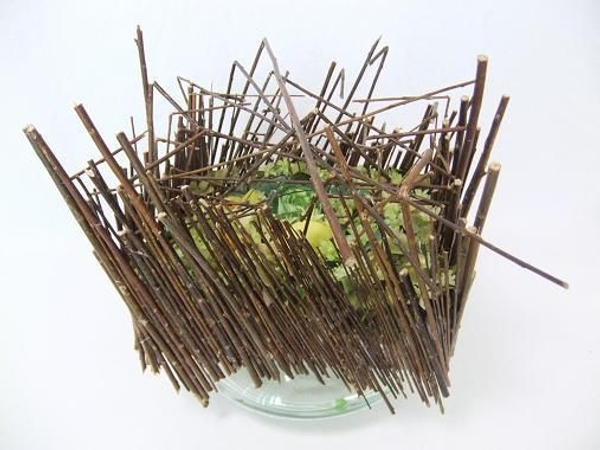
Mostly, it is just easier to work with Mother Nature and allow the available plant material to dictate where and how they need to be placed.
To designers, these “Laws of Nature” are the Principals of Design. Studying the balance, proportion, dominance, contrast, rhythm, harmony and unity seen in natural surroundings, can guide you to create spectacular designs while remaining authentic in natural beauty.
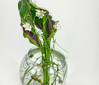
Balance adds both “real” and “perceived” stability to a design. With real stability, an arrangement will not topple over, tip or wobble. Perceived stability ensures the design will not look as if it might topple over, tip or wobble at any moment.
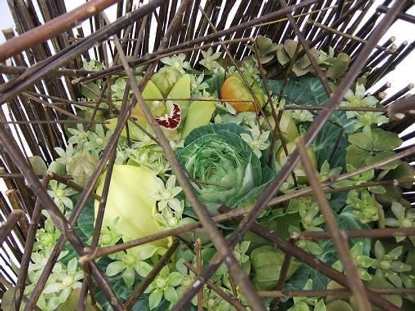
Think of your design as an old fashioned tipping scale with the focal point being the axis or balance point of the scale.
The visual weight of plant material and accessories must appear balanced around this focal point.
Sounds simple enough, but for floral designers to attain design balance is harder because we are working with living, growing and curving plant material that does not come in the exact same shape, nor facing the exact same direction. Nature rarely bothers with perfect symmetry and you, as the designer will need to tip the scale by adding or subtracting elements from your design, balancing the placement of your material in relation to the focal point. The "weight" of your floral ingredients in your design is not just determined by their actual weight but also their visual weight. The further an object is placed from the focal point, the heavier it appears. Objects that are larger, brighter in colour or heavier in texture appear heavier than their contrast. Actual weight can also be used. Adjusting the container in relation to the amount of plant material is a good example. Use a large, heavy container to balance out large amounts of plant material used. Designers need to study the plant material to learn how to compensate and innovate.
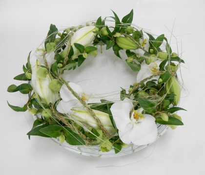
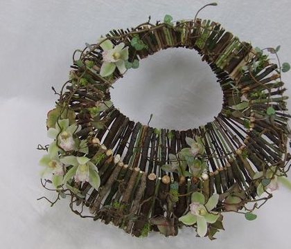
If you study floral art through history, you will notice that more traditional designs are well ordered, static and formally balanced. This Symmetrical Balance creates a mirrored image of the design with equal "weight" on both sides of the focal point. Clean symmetrical designs have a strong contour and appear controlled and calculated.
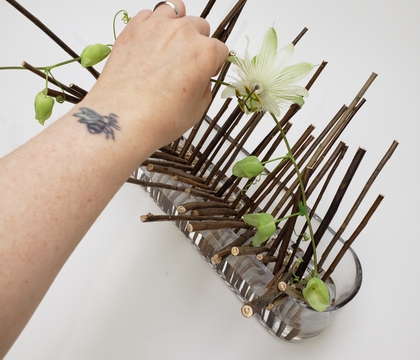
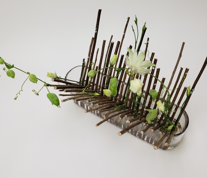
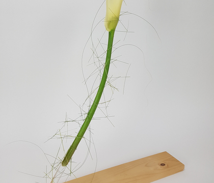
The beginning of Modernism sparked a trend for designs to move away from the strictness and the carefully designed visual center, or focal point, of symmetrical placements towards a more contemporary, informal and dynamic balance. This Asymmetrical Balance is closer to what you will see in nature.
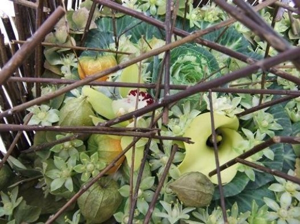
Plant material of dissimilar shapes and sizes are thoughtfully placed in the design to create a visually balanced overall effect.
The focal point of an asymmetrical design is more a focal plane with the attention on the overall structure (or concept) to lend the design its balance and stability.
Proportion and Scale: One of the first pieces of design advice is the traditional proportion rule: The floral part of your design should be one-and-a-half to two times the height, plus the width of your container. It is not a coincidence that this has become such a profound part of our design world.
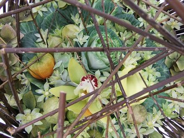
It is in fact a golden proportional rule that can be found everywhere in nature and across all cultures we, as humans, perceive these proportions as beautiful!
There is no mathematical equation to guide scale; it is more of a gut feel. A well scaled design should be of the right size for the place it is displayed in, and use the right size of flower or plant material to fit the size of the structure or vase.
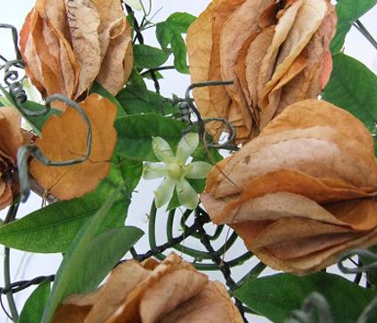
Dominance: If you randomly gather a few floral elements from your garden and place them in a vase, you will have a happy and pretty bunch that competes for attention, all at once. Let's say that you picked a few flowers of one type to be dominant in the design- one element that is stronger in line, colour, shape or amount, that now grabs the attention and emphasize that aspect of the design. This singular dominant element can tie the entire design theme together.
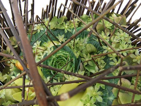
Adding a small accent detail can amplify the effect, emphasizing a focal point.
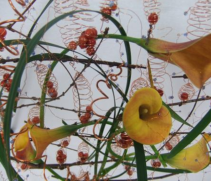
Rhythm, Repetition and Transition: We look at floral designs in the way we would look at a beautiful garden, appreciating the flowers and the spaces left for the plant material to grow and breathe. As your eyes move over a design, you recognize patterns created by objects repeating or graduating in colour, form, shape or spaces. Your eyes will search out these patterns, connecting them like a musician does when playing an instrument.
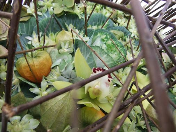
When you place the floral elements close together your eyes will slowly follow the pattern.
If you place the elements further apart your eyes quickly jump searching out element to element. Repeating these design elements creates a connected unit and can add dimension by leading the viewer's eye adding depth to the overall effect.
Contrast and Variation adds adventure, tension, opposition and variation to a design. A touch of contrast can enhance and emphasize differences. Overdoing the contrast will result in a messy contradiction
Harmony: As we develop as designers, so does our perception of harmony. When we start our floral journey we carefully measure and place and question every design detail. As we gain experience and develop our own style, adding bits of our own personality into our work, we start to take calculated risks that develop into our own unique floral signatures.
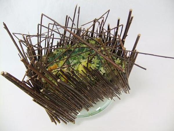
Harmony is when the design just works- the perfect combination of the natural beauty of the flowers, stems and accessories, placed just so, in a perfect place where it seem to shine as a unit.
Learning to read and place plant material in their natural state can be frustrating, especially if you are the type of designer that strives for perfection. Remain fascinated by nature and continue to see and understand the way plants naturally grow, lines curve, and flower heads bend, and you will find your own way to work with, rather than against, these laws of nature.
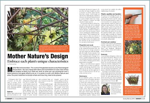
Thank you Canadian Florist Magazine for inviting me to be part of your June issue. It is an inspirational resource for all Florists.
Sign up for my weekly newsletter
Every week I add a new design with related tutorials. Be sure to subscribe to receive an email notification with design inspiration.
